Flexible Theming & Color System
Core tokens • Semantic mapping • Controlled brand variation
Core tokens • Semantic mapping • Controlled brand variation
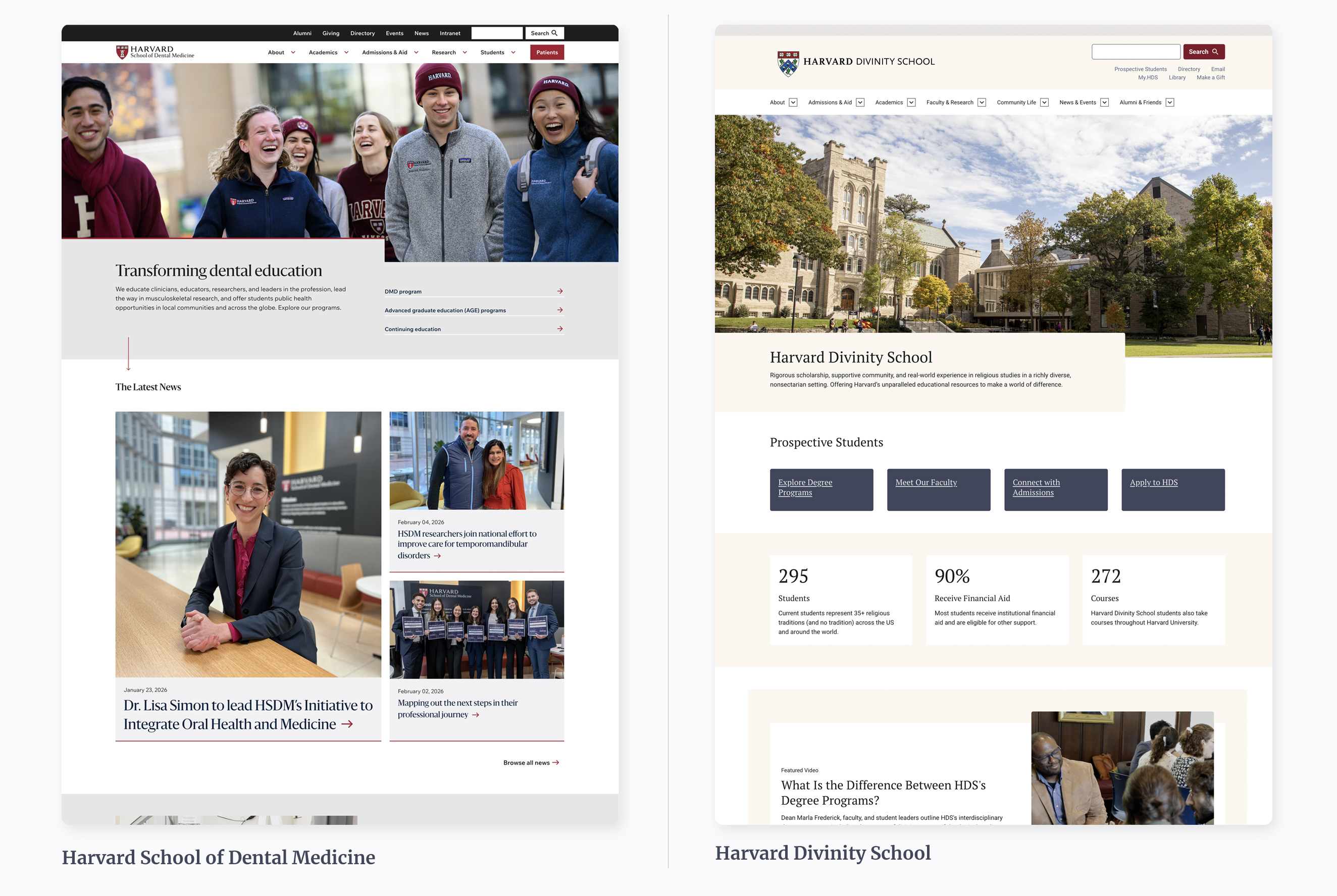
Designed a scalable color and theming architecture to support multiple brands within a shared system foundation.
The work separated core visual tokens from semantic intent, enabling controlled customization while preserving accessibility and consistency.
The university ecosystem required brand flexibility across schools and programs, each with distinct visual identities.
Without structured theming, customization risked breaking accessibility standards and weakening system coherence.
The challenge was enabling variation without sacrificing structure.
Color systems often become brittle when tied directly to brand palettes.
To scale across multiple identities, the system required: Core tokens Semantic tokens Theme layer abstraction Clear override boundaries
Flexibility had to operate within controlled constraints.
Enabled multiple brand implementations within a shared architecture. Reduced duplication across schools and departments. Preserved accessibility compliance across theme variations. Maintained system integrity while supporting visual diversity.
Macro-level system evolution across distributed academic teams.
Golden-ratio type scale and governed semantic token structure designed for consistency and accessibility.
Contribution model, workflow alignment, and shared standards to support cross-team adoption and long-term sustainability.
If your organization is building or refining a design system, I can help align structure, accessibility, and implementation.