Accessible typography & token architecture
Semantic type scale • Governed token structure • Accessibility by default
Semantic type scale • Governed token structure • Accessibility by default
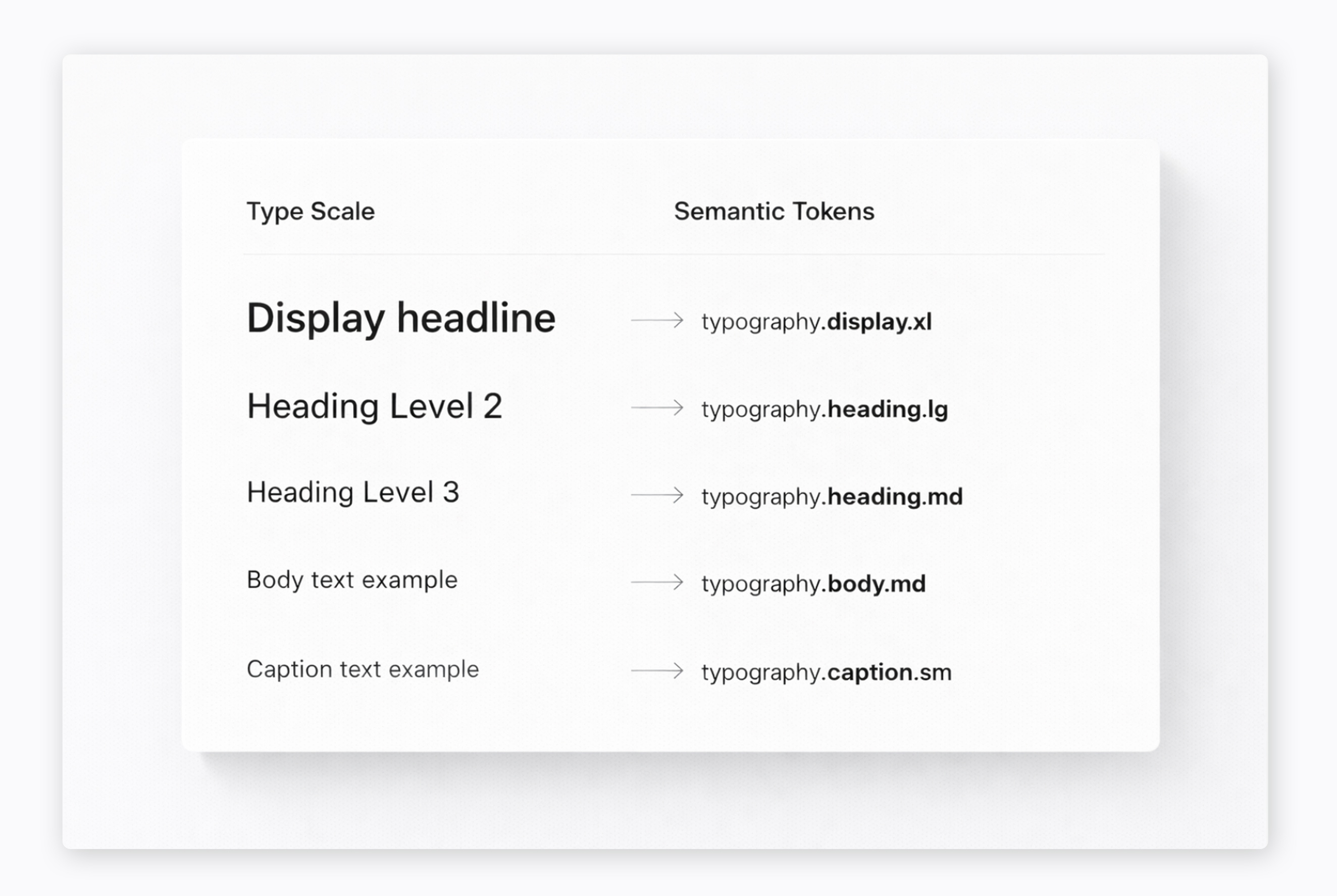
Defined a scalable typography system and semantic token architecture to support consistency and accessibility across a multi-brand digital platform.
This work aligned semantic tokens, accessibility standards, and component usage so that typography functioned as system language, not just visual style.
As the design system expanded across distributed teams and properties, inconsistencies in typography usage created friction and accessibility risk.
Without shared semantic structure, teams interpreted visual styles differently, leading to uneven implementation and duplication across sites.
Typography needed to operate as structured system logic, not isolated visual decisions.
Typography had to serve multiple layers simultaneously:
Accessibility compliance Design clarity Semantic structure Implementation reliability
The challenge was to move from visual styles to governed semantics that could scale across more than 1,000 sites.
Consistent system-level typography across 1,000+ sites. Reduced design to development translation issues. Accessibility standards embedded into foundational tokens. Improved cross-team adoption through clearer semantic guidance.
Macro-level system evolution across distributed academic teams.
Core tokens, semantic mapping, and controlled overrides to support multiple brands without fragmentation.
Contribution model, workflow alignment, and shared standards to support cross-team adoption and long-term sustainability.
If your organization is building or refining a design system, I can help align structure, accessibility, and implementation.